Consistency is Key

Final Slide Design Title Page

Intro

Can this really be our last project?! Time has flown! For this project we needed to pick an advertisement for a company, analyze it,  and then make a new ad to fit in an ad campaign with this other ad we chose (using either Photoshop or Illustrator). We then had to make slides for this campaign, using inDesign, that also matched with the ads (new and original). We needed to have at least 6 slides, one that was introductory, at least 3 showing the analysis of the original ad, and one or more on how the new ad matched and fit the campaign. With those requirements in mind, it was time to find an ad.

The Draft

I will tell you out right, I struggled with finding an ad to do! I wanted to make sure it had good design principles and was a cool ad. I searched and searched and finally came across both a Olay ad and an IBM ad that I liked. I talked with the teacher, who gave the ok for either one, and finally went with the IBM ad:

original ad
Original Advertisment: http://veerle.duoh.com/inspiration/detail/drivers_can_see_traffic_jams_before_they_happen

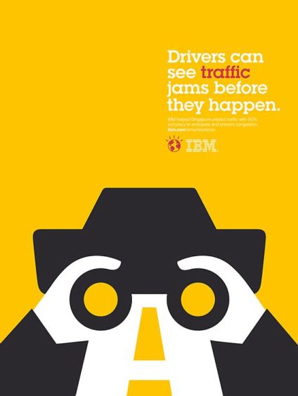
Even thought I knew making a new ad to mimic the style of this one would be tricky, I decided to go with it anyway. Once my ad was selected, it was time to do some sketches and pick my message and audience.

Audience, Message, and Sketches (Oh My)

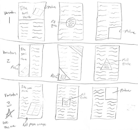
For this particular project, I actually started sketching ideas out first before I figured out my audience and message. The first thing I sketched out were my slide designs. I came up with three options:

Slide Sketches
Slide Sketches

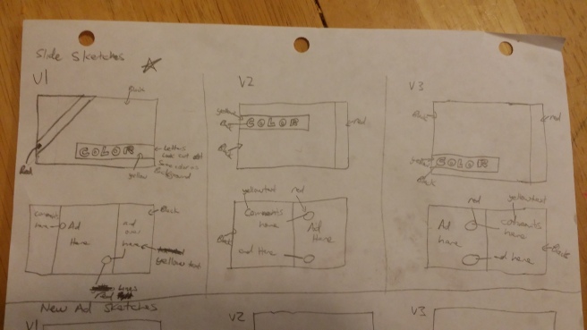
I decided to go with the first option with the ad centered and the diagonal stripe.

Moving on to the ideas for my new ad, I knew for my audience that I would at least be targeting small (or large) businesses, males and females, who could use IBM products. I just didn’t know which product yet. I went on IBM’s website and started doing some research. Three things that I found they were doing were: cyber security, consulting, and cloud computing. Using these ideas, I started drawing out ideas. Let me tell you that this process of going from research to actually drawing was very hard for me because I knew I would need to use the white space to my advantage if I wanted to match the other IBM ad. Finally I started having ideas come and I was able to come up with these three ideas:

Sketches 1 and 2
Sketches 1 and 2
Sketch 3
Sketch 3

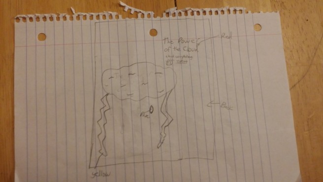
The first idea was to go with cyber security and make the eye look robotic. The second idea was to go with consulting (and have a person in the question mark). The third was to go with cloud computing. The lightning was to look like a face and the cloud was acting as the brain.

Out of these ideas I decided that the last one for cloud computing was the strongest option. I then went and altered my audience and create my message.

The audience now was targeted to small (or large) businesses, males and females, with current or potential cloud computing needs. The message became the need to convey to my audience the power of the IBM cloud and that it can meet their needs. The message also includes my slide design though and what I wanted to accomplish there was to give my audience a sense of uniformity between the slides, the original ad, and my new ad through the use of color and consistent placement.

Typography and Color

Next was to pick the typography and the colors to be used. This part was actually pretty simple to pick because I wanted it to match my original ad. I ran my ad through Whatfontis.com to determine the font used and then searched around for a free version of the font and found one. The font used for the main big text was ITC Lubalin Graph Std. I couldn’t determine what the smaller font was but I could tell it was a san serif font. I tried to match it it was so blurry that I couldn’t get a good match so I went with an overused font but a good one for small text, Arial. With a Slab serif and a san serif, I had a good combination of text styles that worked well together.

Next was color so I pulled up the ad I picked and using a color picker, extracted three colors, Gold, Dark Slate Grey, and Crimson. With me picking the cloud sketch, I also added Teal for the raindrop eye.

colors
Colors

Once all of this was decided, it was time to get started making my slides and my new ad.

First Draft

I started with making the slides first and analyzing the ad I chose to pull out the important design principles that I wanted to transfer to the new ad. This is what I came up with:

First Slides
First Slides

I found the world icon for IBM here and then used Photoshop to change the color to crimson to match the ad. I used the Dark Slate color as the text on top of the yellow to get it a cut out feeling. The main design principles I wanted to pull out and emulate from the ad were that the text lined up with the road lines below (alignment) and the use of the white space to create a cool double image (as well as the typography and colors that we mentioned already). Now it was time to start working on the new ad.

Following my sketch as closely as I could, I was able to come up with this (along with the rest of the slides I didn’t finish above):

New Ad Draft
New Ad Draft
Rest of the Slides
The rest of the slides

The IBM logo came from here and as I mentioned above already, I got the world icon from here and used Photoshop to change the color from black to crimson. I also got the small text from the IBM’s website on cloud computing found here.

More Versions

After getting some feedback from other classmates and the teacher, I decided a couple things needed to change.

Version 2

First, the text position wasn’t quite right. On the original ad the text only took up half the width of the ad and mine was going too far over. I also needed to make the text a little smaller to give it more white space like the original ad has around the text so that I could move my IBM logo and world image over in order to left align it with the text. Second was that someone mentioned that I might only need one lightning bolt, instead of two. I decided to try eliminating the left lightning bolt (or the back of the head) to see if I liked it better. I also decided on my own that the text wasn’t working the same as in the original ad. My ad’s text was short where as the original ad’s was more of a sentence. So I played around with the text and made this version:

Version 2
Version 2

Some other feedback I got was that maybe I should consider getting rid of the crimson color and just use the teal (that the ad had too many colors). After looking at it I decided they were right. By making all the crimson words teal it also made the connection to the original ad stronger. I then decided that “Memory” wasn’t fitting well with the cloud and that I needed to go back to using “Cloud” in my text. I talked with my husband over the phone, frustrated that I couldn’t figure this text out, and together we talked and brainstormed and came up with the perfect text. Because this new text talked about “people” I also added another smaller cloud/person to see if it would make it stronger.

Version 3 or 4 (not sure which)

New ad with two clouds
Version 3 or 4 (not sure which as I went through many versions)

Final

I decided that something was still off though. After talking with my husband again, we decided that two clouds/people would only work if I used some kind of connector between them and since lightning was already being used to make the face of the person, I couldn’t use it to connect them. So I decided to get rid of the second cloud. I kept the first cloud tilted up a bit though as it helped to keep the user in the ad (since the face was looking a little more up towards the text). I also decided that text kind of zigzagged on the right side so I moved the word “of” down to make it more of a block of text. With these changes made, I now give you my final draft of the new ad:

New Ad Final
New Ad Final

Normally this is when I would be finished with the project, but I still needed to update my slides. Since I changed the colors scheme of the new ad from crimson to teal, I decided to also change the new ad slides stripe to teal as well to match the new ad. I also made another change in that instead of looking at the alignment of the text with the road on the original ad and the alignment of the text being parallel with the second lightning bolt (which was now gone), I decided to just talk about the strong alignment of the text with the logo underneath it (rather than go all the way to the bottom of the ad). I also added a border around my new ad so it didn’t get lost in the background. Here are the finished slides:

Final Slides
Final Slides

If you would like to see it in full glory, you can follow this link to a high quality PDF of all the slides: Final Slide Design PDF.

Design Analysis

Now that my new ad is finished as well as my slides, it is time to move on to the design analysis. As always, part of the assignment is to explain my main design decisions and tell how I used the principles of design, typography, color and/or photography in my design. I used the principle of proximity by grouping all my text in the top right of the design (like it is in the original ad). I used the principle of contrast through the accent color used to emphasize some of the text and in the difference in size and typography of the big text and little text. I used a slab serif as the title and a san-serif as the body text (which go well together). I used alignment to align the large and small text with the logo/world icon. I used repetition in my colors, the dark slate grey and gold from the original ad as well as using the teal accent color to mimic the accents in the original ad.

I also used these principles in my slide design as well. The typography from the original and new ad was used throughout the slides (the slab serif as the titles and headings and the san-serif as the body text). I also used repetition of the colors from both ads in the slides (changing from Crimson to Teal when I got to the new ad). I used alignment with each of the titles/headings across all the slides to place them in the same area as well as each of the ads and their comments being aligned in the same places so they were consistent.

Conclusion

In conclusion this was a very hard, hair pulling assignment. I struggled with finding just the right text, the right idea, the right styles to pull this new ad and these slides into the same campaign as the original ad.

Looking at the final design, I think my target audience would be very happy with it. The colors match well together and are consistent throughout both of the ads and the slides. Both ads also give the same kind of message. The new ad speaks of the power of the cloud and how it connected nearly 60 companies and data centers with market leading security products and services. The original ad speaks of how they helped Singapore predict traffic with 90% accuracy to anticipate and prevent congestion. Both have quantifiable data which is impressive to those viewing it. The new ad displays many of the same design, typography, and color characteristics as the original ad without looking the exact same. They feel like part of the same campaign which is the whole idea of this project.

Photography/Image Attribution

The only images I used that were not my own in my project were the original ad, the logo, and the world icon. Each will be shown below and when clicked will take you to the original location they came from:

original ad
Original Advertisment: http://veerle.duoh.com/inspiration/detail/drivers_can_see_traffic_jams_before_they_happen
IBM Logo
IBM Logo: I added the black behind the logo you could view it on my white post. http://www.numerama.com/content/uploads/2017/05/ibm_logo_white.png
Original World Icon
Original World Icon: https://www.ibm.com/developerworks/mydeveloperworks/blogs/60bae85c-5b29-4641-8d2b-dc398a42b8ba/resource/BLOGS_UPLOADED_IMAGES/smarter-planet-logo.jpg

It’s a Colorful Life

Full Page Magazine Ad Final

Intro

I can’t believe we are on our third project already! This project was three weeks long rather than two. We spent the first week learning how to be creative by doing creative activities to get us in the right mind set. The second week was drafting and the third was finalizing.

For this project, we needed to make a symbolic, creative advertisement for a “boring” household product. We used a random generator to pick our product as well as our target demographic (audience). Once we had our product, we picked a brand to go with it. As part of the project, we needed to blend 2+ images together and have a creative headline, body copy, and call to action, as well as the company logo for the brand we chose.

The Draft

Now that you know a bit about the requirements, now I can show you how I started. The first thing to do was to use the random generator to get my product as well as my audience. Here is a picture of a blank generator so you know what the categories are:

project generator-blank

Demographic/Audience

Using the random generator, the product I got was a printer cartridge. Since the printer I have is an HP printer (and because it is a rather popular), I used HP for my brand. For my demographic, I got:

  • Female for the gender
  • 25-34 for the age range
  • “In a relationship” for relationship
  • Associates for education
  • $90,000+ for income
  • Magazines and Blogs for media consumption

Ideas/Sketches

Using this information, I began thinking of different symbolic ideas I could do for a printer cartridge. Here were three of the ideas I came up with (each giving a different message).

ad-idea1
Sketch 1
ad-idea-2
Sketch 2


ad-idea-3
Sketch 3

Message

Now that I had sketched out a couple ideas, I decided it was important to figure out the message I wanted to convey in order to figure out which idea I wanted to use. Since my audience was a female (25-34) in a relationship, I decided I wanted to use my first sketch but use the text and some of the idea I had from the third sketch. The message I wanted to convey with this ad was the importance of printing and preserving memories because memories fade. High quality ink is needed though to represent real life, because life is colorful.

Typography and Design Choices

For the ad, I wanted “life” and “colorful” to stand out so I made them a script font and used a slab serif. I also wanted the colors in “colorful” to repeat the colors in the rainbow (repetition). I couldn’t find a good picture of a paint brush but found a good paint roller I could use. I lined up the cartridge and the paint roller at a diagonal so there was some alignment there to connect them (besides the rainbow that stretched between them).

First Draft

With all of this in mind, here is my first draft:

Full Page Ad Draft
Full Page Magazine Ad Draft
Blog Ad Draft
Blog Ad Draft

After getting some feedback, I needed to re-work some things. The teacher pointed out that having the title “Preserving Memories” with it’s old style typography, felt disconnected. She recommended changing the text around and making the title “Life is colorful” and the body text be “preserving memories” or even “preserve your memories with hp.” I also got the feedback that the text felt disconnected with the line in the middle and that it would be better to have then closer together. I also got feedback on the blog version that the text was too close to or was over-lapping elements and it was creating tension.

Versions 2 and 3

With all this feedback, I made my next draft. For these next couple drafts, I only worked with the magazine ad until I got it right.

Full Page Magazine Ad V2
Full Page Magazine Ad Version 2

With this version, I got feedback that the cartridge needed to be brightened up so that it fit in better with the bright ad, and the bottom of the rainbow needed to have a more crisp edge (which I did figure out how to do!). It was also recommended that I make “is” the same font as “life” and “colorful”. I struggled with the color. I tried a pink color and then decided I liked orange (the complement to the blue of “life”). It is a different orange than the “L” in colorful but it was similar enough to add a repetition. Here is my next draft:

Full Page Magazine Ad V4
Full Page Magazine Ad Version 4 (version 3 was the pink color which I left out)

Final

After this version, I asked the teacher if she could look at it again. The feedback she gave was that I should tilt the title a little to the right so that the eye was led down to the other text below. I found that by tilting the text to the right though, that it didn’t look good because it was going the opposite way of the rainbow. I played around with it a little more and finally think I figured it out. I changed my script font to a print font so that it was a little easier to read. I believe it is a san-serif which goes well with my body text (serif). Here is my final version:

Full Page Magazine Ad Final
Blog Ad Final
Blog Ad Final

Design Analysis

Part of the assignment is to explain my main design decisions and tell how I used the principles of design, typography, color and/or photography in my design. I used the principle of proximity by grouping all my text in the bottom right of the design (rather than one above the rainbow one below for example). I used the principle of contrast through the colorful text and in the difference in size and typography. I used a san-serif as the title and a serif as the body text (which go well together). I used alignment to align the cartridge and the top of the paint roller and I also aligned the text right underneath each other. I used repetition in my colors to tie the rainbow in with my text and I also used repetition to tie the color of the word “life” in with the logo color.

Looking at the final design, I think my target audience would be very happy with it. It plays to a female, age 25-34, in a relationship because that is an age where you take many pictures with your love ones and when printing the pictures and saving them matters. She could use pictures as a present for her loved one, along with many other things. The ad is bright and colorful and draws attention.

Conclusion

This assignment was a hard one for me. Making an advertisement from several different images and blending them together was not easy but at the same time it was fun! It helped me to find a more creative side of myself.

Photography Attribution

Here are each of the images I used in my project.

Only one of the four images were taken by me this semester. 

  • The background image was taken from unsplash.com can can be found here: https://unsplash.com/photos/_wTLpjsU8WA.
  • The paint roller was taken from pexels.com and can be found here: https://www.pexels.com/photo/painting-black-paint-roller-8614/.
  • The HP logo was taken from wikamedia and can be found here: https://commons.wikimedia.org/wiki/File:HP_logo_630x630.png. I added the white underneath the logo myself.
  • The printer cartridge image I took myself.
background image
Background Image
painting-black-paint-roller
Paint Roller


HP_logo
HP Logo
Printer Cartridge
Printer Cartridge (taken by me)

Delivering a Clear Message

Icons Final Draft

Intro

My next project was to make an set of 4-6 icons. Each icon had to communicate a single message. We couldn’t use symbols, text, drop shadows, pixels or raster effects. They needed to be able to scale up or down and still look good. All the icons also needed to have similar design styles so they looked like a whole set (rather than 6 random icons). With these requirements in mind, I knew exactly what I wanted to design!

Getting Started/The Draft

For my CS 371 Human Computer Interaction class, I am redesigning a website to be more user friendly. The site I chose was my tutoring website that I made last year. In my redesign, I have four sections on my main page: services, how it works, mission, and contact. On the page I have spot for either a picture or an icon next to the title of each section and I thought to myself, why not make icons to put with these four sections? Since that would only give me 4 icons, I decided to also make icons for the male and female avatars that I use for testimonials (for those who don’t feel comfortable sharing an image of themselves on the site). With an idea ready, I moved on to figure out my audience and the message I wanted to communicate through them.

Audience and Message

When thinking about the audience for my icons, I realized the audience would be the same as the audience I have for my website. These would be college students ages 18-50 (for those coming back to school after their kids are grown). They will be a mix of male and female but there will probably be slightly more females than males. They will also be students in the web design and development program (since that is what I tutor for) who are struggling with their classes.

The theme, or message of my icons, is a theme of business. Each icon will represent a different areas of my tutoring site (as I mentioned above) as well as avatars for my testimonials section. I want my icons to convey to my audience an air of professionalism that will give a sense of ease and comfort when using my site.

Sketches

Once I decided the “single message” that each of my icons would convey (services, how it works, mission, contact, a female user, and a male user), I got some paper and pencils out to start sketching some ideas of what they would look like. Before I started sketching though, I took to the internet to look for ideas of what these icons should be. I knew that for how it works I wanted to use some gears and I decided I wanted to use three gears rather than just one to show how they fit together. For mission, the arrow in the bulls-eye of a target seemed to be the most common way to communicate the “mission” or “aim”. For contact, I went with the standard envelope. Services took me a little while to figure out. The most common for services were gears or two hands shaking. Since I was already using gears, that left hands shaking. I am really terrible at making hands (which is why all of my drawings of people have their hands in the pockets or behind their backs :D) so I tried to find another option. I thought about doing a clipboard with a list on it but it just didn’t seem as strong as the shaking hands. I finally gave in and decided to give the hands a try and use the list as a fall back.

I tried three different variations: thick outlines, thin outlines, and a combination of the two thicknesses inside a circle (shown in the picture below).

Icon Sketches
Icon Sketches

I decided after sketching them that I liked the first option. The circles were nice but I liked the thick outlines and felt my icons would have a more professional look without the circles..

Colors

Next I had to decide my color scheme. I decided that the icons should probably match the colors from my site. I opened up paletton.com (which I used for my magazine draft a couple weeks ago) and put in my main salmon color from my website. As a triad, I got a similar blue to what I have on my site and a nice green, I decided to look at what a tetrad would give me and it gave me a nice peachy orange with the other colors. The peachy color would work well for the skin on the hands and for the people as well as maybe my envelope. The pink, blue, and green would work nicely for everything else.

First Draft

Now that I had my icon ideas,  sketches, and colors I decided to get on the program and give it a go. Here is what I came up with for my first draft.


First Draft
First Draft

This was my very rough draft. Some of these I didn’t have to tweak much but some still needed work. My shaking hands were what needed the most work. As I said before, I am not good at making hands. My people also have some rough edges. After getting some critiques I found out a couple things.

  1. My shaking hand really needed some work. The teacher suggested that I pull an image from the internet in to practice on until I got the hang of how the curves should go. Once I figured it out, I then free handed some new hands next to my trace (so I could look at it for reference) until I got the curves just right.
  2. My colors were not quite working together to make my icons look like a set. At first I had the same peach for the envelope that I do for the skin colors, and the male’s shirt was the same blue as the cuffs, but I didn’t want them all blending together so I used different shades of the colors throughout rather than making them the same. What I learned was that there were so many colors that it wasn’t connecting them together. So I needed to fix that.
  3. I needed to smooth out the bumps on my avatars so that they looked more professional. I realized they looked like they only had one shoulder so I added another bump in on the other side and smoothed all the other bumps out.

Versions 2, 3, and 4

After making the changes mentioned above, I got version 2:

Version 2
Version 2

The colors in this version worked better together and helped the icons to feel more like a set, but something was still off. The peach color I used was a little too orange. I took the color and lowered the saturation and that helped. I also realized that my cuffs on the shaking hands were accidentally different shapes, so I fixed that as well to get this version:

Version 3
Version 3

After this version, I only had two more things to fix. I decided that most of my icons had a round edge to them except for my envelope. I rounded the edges on it and called it good. Lastly, my two small gears were a little too close together and were creating tension. I gave it a little more space and got my final version.

Here is a 9in by 6in board with all 6 of my icons on it. I will also include some 60px by 60px and some 400px by 400px versions to show that they scale up and down well (as per the instructions).

Version 4/Final Draft
Version 4/Final Draft (9 in by 6 in)
Small Hands
Services
Small Gears
How it Works
Small Target
Mission
Small Envelope
Contact
Small Female Avatar
Female Avatar
Small Male Avatar
Male Avatar


Large Hands
Services
Large Gears
How it Works
Large Target
Mission
Large Envelope
Contact
Large Female Avatar
Female Avatar
Large Male Avatar
Male Avatar

Design Analysis

Part of the assignment is to explain my main design decisions and tell how I used the principles of design, typography, color and/or photography in my design. Since these were icons though, I didn’t use typography or photography in my design. I also didn’t really use all of the principles of design since these were simple icons. I did use the principle of repetition in my stroke weight and in the different colors I reused throughout to help unify my icons and make them look like a set. I also used the principle of contrast a little bit with my colors because I chose to use a tetrad color scheme (which are two sets or complementary colors). I didn’t end up using the green in my final design though so it isn’t a true tetrad but the colors do contrast each other pretty well.

When choosing my, I wanted to pick colors that would help convey my message. If you look at the color psychology of each color:

  • Blue gives a sense of trust and safety (which is why police where it) and I want my users to feel that they can trust me.
  • Orange (in all it’s tints and shades) is the color of youthful energy, adventure, and rejuvenation. It encourages people to linger and be active (which is why restaurants use shades and tints of orange, like browns, tans, and peaches so they aren’t bright and in your face but still carry those characteristics).
  • Pink/salmon is a tint of red which is an emotionally intense color. This is why it is used less than the other colors. It gives a feeling of energy like orange and helps draw attention. I feel this is enough of a muted version of red that it isn’t too demanding of a color.
  • Black was used for the strokes on my icons because black is a professional/formal color and since I wanted my icons to convey a sense of professionalism, I used black.

Conclusion

Looking at the final design, I think my target audience would be very happy with this set of icons. It, in my opinion, feels very crisp, clean, and professional. It uses repetition in the colors and stroke weight to bring unity to the piece, and it uses colors that convey my message of trust and professionalism. I learned that even though they are just icons, I still need to think about the principles of design. Even though I didn’t use all of them, there were still some important principles, like repetition, that when added, helped me turn my draft into a final product. I also learned a lot about how to use illustrator and hope that I can get even better with my pen tool with practice.

Designing for the Real World

Page 1 of the Final Magazine Spread

Intro

Welcome to my first project! This project was to make a magazine spread using a talk from either lds.org or byuiscroll.org. The hard part was picking a talk that didn’t have any heading besides the title. We had to add 3+ of our own headings and pull a quote out of the article to display as a pull quote. We also had to take at least 2 of the pictures in the spread ourselves (the rest could taken by someone else) and use all of the principles of design and typography to tie everything we have learned up to this point all together. I want to share the final draft of my magazine spread here first so you can see how it turned out but then I want to go back to the beginning to show you how I got to this point.

Page 1 of the Final Magazine Spread
Page 1 of the Final Magazine Spread
Page 2 and 3 of my Final Magazine Spread
Page 2 and 3 of the Final Magazine Spread. Article from: https://www.lds.org/general-conference/2017/10/gods-compelling-witness-the-book-of-mormon?lang=eng

The Beginning/The Draft

To start I think it would be important to tell you about how I started this project. I chose the talk called “God’s Compelling Witness: The Book of Mormon” from this last General Conference in October. The article is about the Book of Mormon and Joseph Smith.

Target Audience

Before even starting to design our spreads we needed to define an audience for our project. The audience I chose was latter-day saints and investigators, both male and female, ages 12+. I chose this age as the starting age, because 12 is when children become teenagers. It is when they begin to really think for themselves and choose their own paths. I chose latter-day saints and investigators because the article I am sharing is about the Book of Mormon and its beginnings. It is a good place to start for an investigator and a good topic for latter-day saints looking to reaffirm their testimonies.

Message and Design Decisions

The message I wanted to convey through my design was a message of peace, and what is more peaceful than nature. As I mentioned already, the article I chose talks about Joseph Smith and how the Book of Mormon came to be. Joseph went out into nature to ponder and pray. This is why I chose to use my son as the one holding the scriptures in the picture on page three. He is too young to be Joseph Smith, but he is a young boy striving to learn and study. This message helped me choose where to take my pictures and even which colors to use in my project. When using paletton.com to chose my color scheme I went with neutral colors like brown and green. I chose a triad off of the brown as my base and got green and blue with it, so these are the main colors I used throughout my design.

Typography Choices

As part of the assignment we needed to chose from at least two different typography categories. For mine I ended up using three. From what I have read, a serif as the body text is the easiest to read in print (Go pick up a book and see for yourself! They will all be some kind of serif font). So I went with Georgia as my body text. For the title, I wanted to use a script and after trying many different ones, I finally decided I liked Vivaldi. To contrast with this font, I chose to use a san serif with it because it contrasted best: very curly vs very smooth, thin vs thick, etc. (which is why I ended up with three categories…). Eras Bold ITC worked really well with Vivaldi so I chose that one.

Sketches

Once all of that was decided, I sketched out 3 different layouts I could use for my spread.

Layout Sketches
Layout Sketches

After looking them over, I decided to go big and try the third variation which is a full page image on the first page.

First Draft

I want to show you my first draft because it shows just how far I came through this assignment.

First Draft
First Draft
pg 2 and 3
pg 2 and 3

When I first started, I thought we needed to use the full article on our three page spread. Because of this thinking, I added text on the tree of the first page so that I could fit it all. This left me not much room for the title. The background was also tricky to get the text to show up so I ended up putting text wherever I could that made it easier to read. This is very bad practice. Not only did I break the proximity principle of design by separating the two parts of the title, I also broke the alignment principle several times. Also by having the text under the title jump up to the text at the top of the tree, it made it hard to follow the text. My second page was pretty good by my picture of my son reading the scriptures was taking my readers eye down to the page he was reading and then up and out of the spread. This isn’t good practice either. My background was also too white. It needed some contrast.

Back to the Drawing Board

After getting critiques by two other classmates and the teacher, it was time to fix my draft.

Version 2

Version 2
page 2 and 3
page 2 and 3

After finding out I didn’t have to have all of the text from the article on my spread, I reworked it so that I had more room for my title to put them next to each other and make them easier to place together. I moved my picture to the bottom right corner to help bring the eye into the spread and also added an extra image on page 2 and 3 behind the text to give it some more color. But something was still wrong. My text was wrapped too close to the scriptures on page 1 that I was creating tension. Another thing that was mentioned was that my title was read together now but seemed disconnected because they were two different font colors. So I went back to rework it.

Version 3

Version 3
Version 3
page 2 and 3
page 2 and 3

With this version, I made the title all one color and used my script font in both sections to really connect them together. I also added some space between the scriptures and my text. But something was still not right. For one by adding the space for my text around the scriptures, I was creating funny spacing in my lines (since I changed the alignment to justify left). The title also wasn’t contrasting much now. It was all one flat color. Someone suggested I add a second color maybe on the words with the script font and I tried it out. Which takes us to the last and final version #4.

Version 4 (Final Draft)

Page 1 of the Final Magazine Spread
Final Magazine Spread
Page 2 and 3 of my Final Magazine Spread
Page 2 and 3

I know I already showed these images at the beginning but I wanted to show them again now in sequence. I moved the text around such that it got rid of the funny spacing, I changed the color of the scripted font to green to give it some contrast with the brown, and now have this version fourth and final version of my magazine draft! It was a long time coming but I am proud of it.

Design Analysis

I want to take a minutes and just explain quickly how I used the principles of design and typography in my design. I used the principle of proximity in the end to group my title together and keep it separate from my body text. I used the principle of alignment on each of the columns but also on the right hand side of my title it is aligned with the column below it, connecting the two even though there is space between them. I used the principle of contrast in my font choices and in my contrasting colors in the title. I used the principle of repetition by repeating my colors from the title throughout the piece giving it a uniform look (the brown in the title and on the border, the green in the title and in the pull quote box, the greens and browns in my images, etc.) I also repeated fonts. All the headings are the same san serif used in the main title and I repeated the script font twice in the title to give unity as well.

Looking at the final design, I think my target audience would be very happy with it. It uses the neutral colors to give that peaceful, nature look and it uses images that aren’t busy but are of something quiet and serene.

Conclusion

In conclusion, I learned a lot from this assignment. In the beginning I wasn’t thinking too much about the principles of design and how they would fit in. I was worried about meeting the minimum criteria for the project. After getting some good critiques on that first draft I really started to see and remember these principles and how important they were. If I had just started this project a little more design oriented, I think my first draft could have turned out better. I can say for sure though, that I came a long way from the beginning of it to end.

Photography Attribution

Here are each of the images I used in my project. All three were taken by me this semester. Two were taken specifically for this project and the third was one I took before thinking I could use it in my photography blog post and then didn’t (the leaf). I cut it out to use on pages 2 and 3. The tree picture originally had a sun spot on the tree by right above the scriptures that I had to Photoshop out so you could read the text easier.

Scriptures by the Tree
Scriptures by the Tree (page 1)
Matthew Reading
Matthew Reading (page 3)
Left
Leaf (cut out and used on pages 2 and 3)